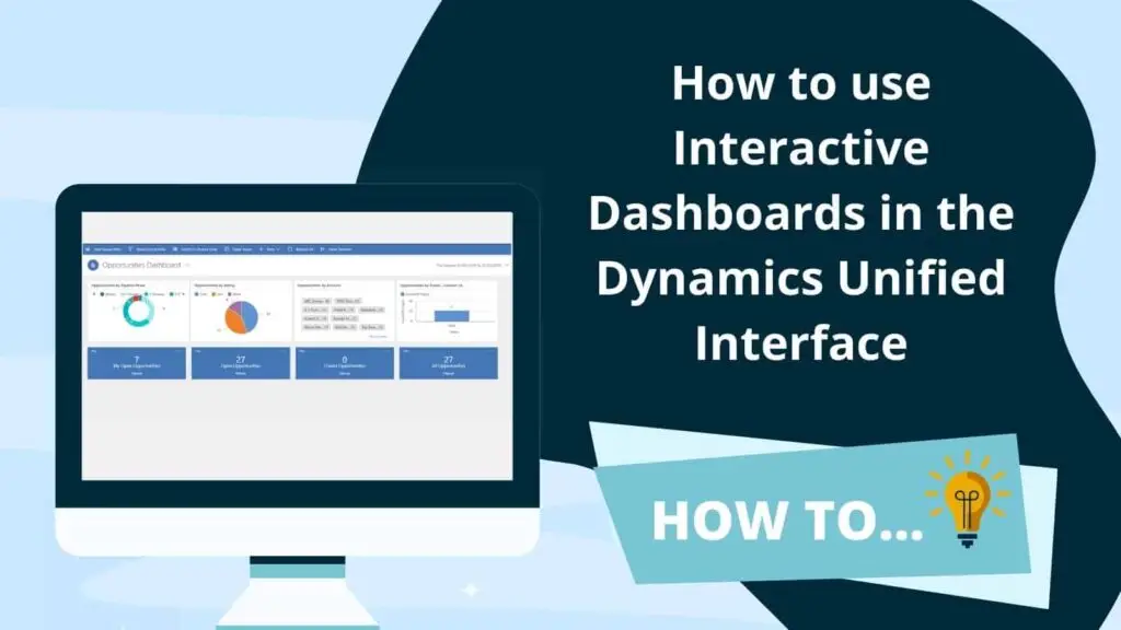
Dynamics 365 Interactive Dashboards are now available for pretty much all record types in the Dynamics Unified Interface. If you’re used to the standard “classic” Dynamics dashboards, then you may be wondering what is an interactive dashboard. Well, I’m glad you asked because they are simple to create and are even simpler to use. A lot of our customers are now using them for their day to day activity management.
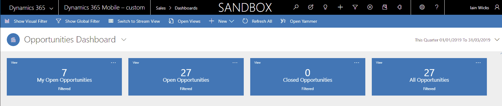
Dynamics 365 Interactive Dashboards offer a great way to slice and dice your work streams with just a couple of clicks. We have found that our users and customers absolutely love them. You can use multi-stream dashboards or an entity specific dashboard. In this post we’ll take a look at the out of the box Opportunity Interactive Dashboard, which is an example of a multiple stream dashboard.
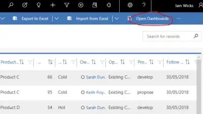
Opening the dashboard
Browse to the opportunities area of Dynamics and click on Open Dashboards in the ribbon.
The interactive dashboard will open as a stream view.
This is the default view for an interactive dashboard.
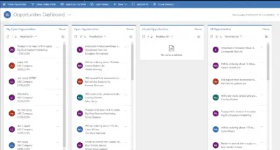
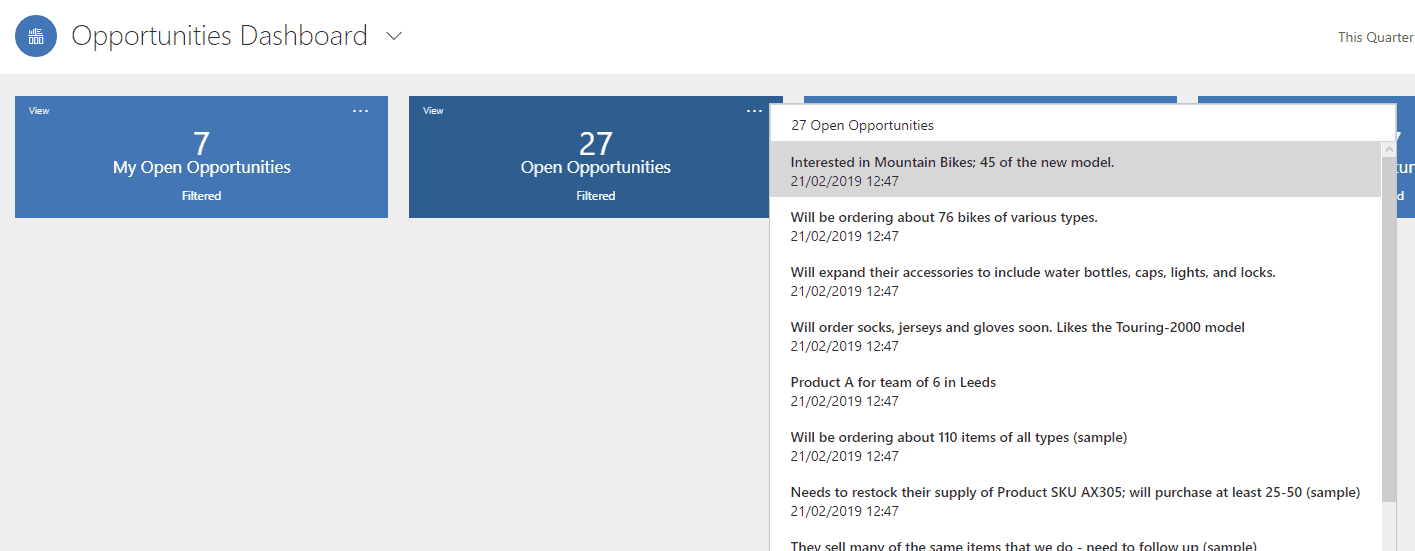
Streams
A stream is another name for a CRM view. When creating interactive dashboards, you select the system views you want to see. You can add as many views as you want. If you chose single stream when you created the dashboard then you can only have one stream, but instead you can add more charts and tiles.
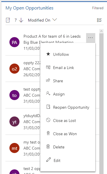
Streams are a great way to manage multiple records at a time. Using streams, you can multi-select and group edit records or you can take actions on individual records such as,
- Opening and editing the record
- Emailing a link
- Sharing
- Assigning
- Closing as won or lost
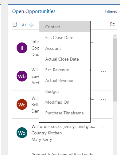
You can also change the sort of the list very easily with a drop down box
Tiles
Press Switch to tile View. Now you will see the streams have turned into tiles.
Each tile offers a count of the opportunities within that view. This is fantastic for a quick overview of how many opportunities are in each pot.
We would love for some future enhancement of this feature so that we could aggregate the data in a different way (for example a SUM, MIN or MAX function), but for now we are limited to a count.
If you click on the ellipsis in the tile you can view the stream of records, and open any of them directly.
You can flip between the tile view or the stream view at any time.
Date Range Filter
Next, notice the date range in the top right corner.
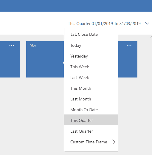
There are a set of predefined date parameters, or you can select a custom time frame. The fact that you can filter on dates within the dashboard means that you may not want to use a date filtered view when you set up the dashboard initially e.g. create a dashboard based on all opportunities rather than on only those created this year.
In fact there are so many filtering options in an interactive dashboard that you really want to apply as little filtering as possible to your original view and stream views that are used to create the dashboards so that the filtering can be applied within the dashboard.
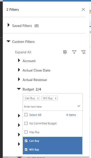
Visual Filters
Click Show Visual Filter

The visual filter, allows you to display charts, which actually act as filters for the whole dashboard (similar to the visualisations in Power BI) You can apply as many filters as you want to drill down into the data.
In the view above, I click on the warm segment in the second chart, the whole dashboard is filtered to only show the opportunities that have a rating of warm.
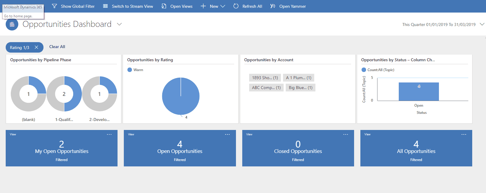
The filter appears at the top left of the charts. I can remove the filter by just clicking the cross. or I can clear all filters by using the “Clear All” button.
![]()
Global Filters
The last great feature we want to show you on interactive dashboards is the global filtering tool.
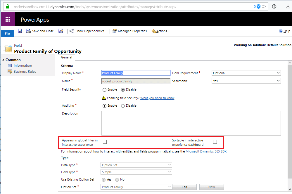
This tool allows us to, once again, filter the whole dashboard but this time we can choose a field to filter on.
As an administrator, I can choose which fields I want to add into my global filter. To add a field to my global filtering options I simply go to the field definition area for the field I want to include and tick a box to allow Global Filtering on interactive dashboards (see below). This is also where you can include a field for sorting the streams. When you make the change to your field don’t forget to publish in order to see the change in your dashboard.
Summary
We would definitely encourage you to start using and creating interactive dashboards as your next CRM mini project. With so many obvious benefits for no additional cost it would be silly not to.
In order to make your dashboards just right, you will probably need to experiment a little with different charts, filters and views. You will also need to decide which security roles you want to enable the dashboard for.
In our opinion interactive dashboards are not yet perfect and could prosper from a few little minor additions. But, overall, we think that the interactive dashboards are one of the best and most important features in terms of user adoption that we have seen in the Dynamics product range since the unified interface itself. In a lot of cases the interactive dashboards have achieved more “wow” moments in client meetings than the unified interface. Well done Microsoft!
Rocket CRM
Rocket CRM are specialists at implementing CRM systems for companies in the SME sector. When implementing CRM it is important to understand the need to keep things simple and to focus on the right things to make a CRM project successful. We know you don’t have unlimited budget, time and resources thats why we chose to work with Dynamics 365 because it is perfect for small business scenarios, due to it being so easy to configure and deploy. Our experienced team will help you to get the best CRM system possible for your budget.
Get in touch and tell us about your requirements 0808 167 4255.
ABOUT ROCKET CRM
Rocket CRM is a Microsoft Dynamics 365, and a platinum Click accredited partner, helping small to medium-sized businesses and charities harness the power of scalable CRM technology. Our mission is to make powerful CRM software simple with custom-built, user-focused solutions.
Website: rocketcrm.co.uk
Podcast: RocketPod
Social: LinkedIn